NOAA/NCEI U.S. Climate Division Data Plotting Page: Help
Input Years | Base Climatology Period | Contour Interval and Range | Sample Plotting Session
Dataset:
Data can be obtained from NCEI's climate division dataset webpage. The dataset covers January 1895 to "present". Typically the data is updated between days 4 and 12 of the following month
Variables:
- Precipitation
- Total liquid precipitation (snowfall, if any, is melted) units are inches.
- Temperature
- Averaged from average daily temperature. Units are degrees Fahrenheit. Average daily temperature is defined as (T maximum+T minimum)/2. Maximum and minimum temperatures for the divisions are not currently available.
- Maximum Temperature
- Average of the daily maximum temperature.
- Maximum Temperature
- Average of the daily minimum temperature.
- Heating Degree Days
- Total degrees obtained for a month by subtracting the daily average temperature from 65F if it is 65F or less.
- Cooling Degree Days
- Total degrees obtained for a month by subtracting 65F from the daily average temperature for temperatures above 65F.
- Palmer Drought Severity Index
- A derived number indicating the current drought. It includes past precipitation and temperature values. It is itself an anomaly and so plots of anomalies of the PDSI don't make sense.
Other variables are not currently available including maximum and minimum temperature (or I would include them).
Seasons:
Seasons are calculated by averaging the value for each month of the season (or summing for precipitation). All processing is then applied to this one number/year. Seasons can be wrapped around the end of a year. If you want Dec, Jan and Feb choose Dec for 1st month and Feb for 2nd. To specify the year for a season, use the year of the first month in the season. Dec-Feb 1982-83 would be specified as 1982.
Type of plot
-
Average Anomaly
A value for each year is calculated first. The average value (e.g. averaged over 1981 to 2010) is subtracted from the value for each year. Plots are scaled somewhat depending on the values of the anomalies. Alternatively, a contour range and min/max can be input. PDSI will plot "mean" and not "anomaly" value if anomaly is selected.
-
Average Standardized Anomaly
Average anomalies are calculated for each year as above. The the values are divided by the standard deviation for each year. Note that this is appropriate for temperatures which are generally normally distributed but less so for precipitation which is not, especially in dry years. For dry regions, you may want to look at rankings instead. Alternatively, a contour range and min/max can be input. PDSI will plot "mean" and not "standardized anomaly" value if standardized anomaly is selected.
Mean:
This is the average value for the season (for each year) for temperature. It is the total value for each season for precipitation.
-
Percentile relative to complete dataset:
All of the available years of data are sorted for the season chosen. These rankings are scaled so that they are out of 100% and the percentile is plotted. For example, If there are 4 years1990 56F 1991 62F 1992 50F 1993 63F
Then the years would be sorted to 1992, 1990, 1991, 1993. The ranking for 1991 would be "3"; that is, it is the 3rd highest year. It will therefore be in the 75th percentile. -
Ranking relative to complete dataset:
All of the available years of data are sorted for the season chosen. The ranking is plotted. There is one less year when you season spans Dec-Jan. Ties are not handled explicitly. The sorting program will arbitrarily rank ties.1990 56F 1991 62F 1992 50F 1993 63F
Then the ranks might be 2,3,1,4. -
Climatology
The average value for one of 7 time ranges is available. Those are now:- 1950-1995
- 1961-1990 (climate normal period)
- 1971-2000 (climate normal period)
- 1981-2010 (current climate normal period)
- 1895-2000
- 1998-2007 (last 10 full years)
- 1998-2007 (last 15 full years)
- 1950-2007 (1950 to present)
Jun  Jul  Aug       Jun  Jul  Aug

 57   67   77       1.0  2.0  1.0  average for each month for 1950-1995
Then the value plotted will be 67 for temperature and 4.0 for precipitation.
Years to enter
Base period
- 1950-1995
- 1961-1990 (a climate normal period)
- 1971-2000 (climate normal period)
- 1981-2010 (current climate normal period)
- 1895-2000 (entire time-period using full years)
Contour Interval
Units
White for center values
Sample Plotting Session:
| Plot 1 | Plot 2 |
|---|---|
 |
 |
Plot 1
- Choose the variable temperature
- Choose the type average anomalies
- Choose the beginning month Dec and ending month Feb
- Choose the climatology base period 1971-2000
- Enter the years 1957 1982 1991 1997
- Choose the contour interval/range -8 to 8, interval 1.0
Plot 2
- Choose the variable temperature
- Choose the type average standardized anomalies
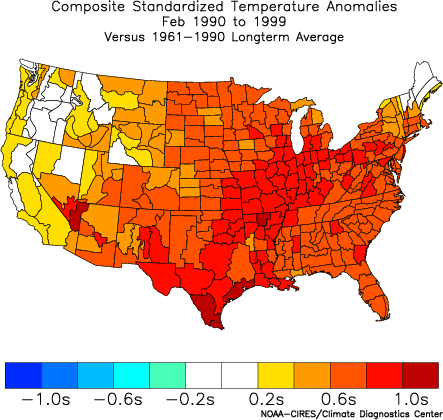
- Choose the beginning month Feb and ending month Feb
- Choose the climatology base period 1961-1990
- Enter the year range 1990 1999
Comments: For the first plot, I used years obtained from What are ENSO years to define the El Nino. Note that we must use the year of the December of the winter season. Anomalies are defined relative to the average over 1971 to 2000. I entered the contour range and interval. If I hadn't, I would have gotten the default (which tries to be reasonable but may not be what you want).
For the second plot, I chose standardized anomalies which scales the anomalies according to the standard deviation for February. I chose the climate normal period of 1961-1990 as that what was often used to look at temperature anomalies during the 1990's. Note if I change the base period to 1981-2010, the values decrease as the climatological temperature has generally increased. Here I used the default contour interval.